Retro Style Font: Ultimate Guide to Vintage Typography
Contents
- Why Are We Still Obsessed with Retro Style Font in 2026?
- What Makes a Great Retro Style Font?
- Meet Refont's Retro Font Generator: A Smarter Way to Create Retro Style Font
- How to Create Retro Style Font with Refont's Retro Font Generator
- Retro Style Font Inspirations & Real-World Use Cases
- Frequently Asked Questions About Retro Style Font
- Start Designing with Refont's Retro Font Generator Today
Let's be honest: we live in the age of Helvetica fatigue. Scroll through any brand's social media feed today and you'll notice something uncomfortable — everything starts to look the same. Clean grids, minimal layouts, the same three sans-serif fonts rotating through an infinite loop of "modern" design. It's polished. It's professional. And it's completely forgettable. That’s precisely why retro style font is enjoying a resurgence—it’s not a passing fad, but a profound visual counter-revolution. And in this guide, you'll learn not just what makes a great vintage font, but how to actually create one using Refont's retro style font generator, even if you've never opened a design tool in your life.
Why Are We Still Obsessed with Retro Style Font in 2026?
Here's a question worth asking: in a world of AI-generated everything and hyper-modern aesthetics, why do 70s bubble letters and 80s neon scripts still stop people mid-scroll? The answer isn't nostalgia for nostalgia's sake. It's something deeper. We're living through what design theorists call aesthetic homogenization — the tendency for visual culture to flatten into a single globally accepted "default" style. Platforms reward consistency, algorithms prefer familiarity, and the result is a digital world where every startup logo, every Instagram grid, every product packaging looks like it came from the same mood board. Retro style font breaks that pattern. They carry texture, character, and a kind of visual authority that says: we have a history, we have a story, we're not just another startup. And the data agrees. Vintage aesthetics have maintained consistent search and engagement growth across Pinterest, TikTok, and Etsy for the past five years — with no sign of slowing down. If anything, the more sterile digital design becomes, the more powerful the contrast of a well-crafted retro style font becomes.
The Core Elements of Retro Style Font Aesthetic
Before you can judge whether a retro style font is good, you need to understand what makes something feel retro in the first place. It comes down to four visual ingredients:
- Texture — The grain of aged paper, the bleed of letterpress ink, the wear of time. Texture is what separates "retro-inspired" from "genuinely vintage."
- Imperfect Strokes — Handmade irregularities: the slight wobble in a brushstroke, the uneven baseline of hand-lettering. Perfection feels cold; imperfection feels human.
- Bold Color Palettes — Burnt orange, mustard yellow, avocado green, neon magenta. Each decade had its own chromatic signature, and using era-authentic colors amplifies the retro effect dramatically.
- Ornamentation — Decorative serifs, inline strokes, layered drop shadows, border flourishes. In retro typography, the font itself is meant to be art.
Why Retro Style Font Aesthetics Are Critical for Branding Today
Here's what neuroscience and marketing research keep confirming: people don't make decisions based on logic first. They respond to feeling first, then rationalize. A well-chosen vintage typography for branding triggers something no modern sans-serif can: cultural memory. When someone sees a 70s-style groovy font on a candle brand or a 80s neon script on a streetwear label, they're not just reading words — they're feeling an entire era. That emotional shortcut is worth more than a thousand words of copy. This is why an Etsy shop using retro-styled branding consistently outperforms generic-looking competitors. It's why TikTok creators who use vintage typography in their thumbnails and Story covers drive significantly higher click-through rates. It's why POD sellers with 70s groovy font designs on their Redbubble storefronts keep landing bestseller badges. Retro style font isn't decoration. They're strategy.
What Makes a Great Retro Style Font?
Not every font that looks dusty qualifies as a great retro style font. "Old-looking" and "authentically vintage" are very different things — and your audience can feel the difference, even if they can't articulate why.
The 3 Pillars of a Good Retro Style Font
Authenticity — Does It Capture the Era?
The first test of any retro style font is simple: which era does it actually belong to? 70s fonts speak in flowing curves and organic, rounded letterforms — think psychedelic rock posters and groovy hand-lettering. 80s fonts shift to sharp geometric angles, metallic gradients, and that electric energy of early digital culture. A font that vaguely mixes both ends up belonging to neither decade, and reads as costume rather than character. Era authenticity isn't pedantry — it's the difference between a brand that feels real and one that feels like it's playing dress-up.
Readability & Balance
Here's the cruel irony of decorative typography: the more beautiful the font, the more dangerous it becomes. Heavy ornamentation can make a headline completely illegible at small sizes, or worse — readable but exhausting. The best retro style font maintains a careful tension between decoration and communication. Tracking (letter spacing), leading (line height), and stroke weight contrast are the invisible controls that determine whether a vintage font is art you can also read, or just art. A stunning font that fails to deliver your message clearly is just expensive wallpaper.
Personality & Emotional Expression
Think of your font as the tone of voice for your brand's visual identity. Before you pick a style, ask yourself: what should someone feel in the first 0.3 seconds of seeing this? Groovy and psychedelic fonts say fun, freedom, counterculture. Gothic blackletters say authority, tradition, rebellion. Warm script handwriting says personal, handcrafted, trustworthy. Neon synthwave fonts say energy, ambition, the future as seen from the past. Start from emotion. Let the visual follow. That's the order that actually works.
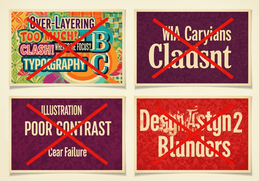
Common Retro Style Font Design Mistakes to Avoid
Even with the right font, it's surprisingly easy to derail the whole effect. Watch out for these four frequent offenders:
- Over-layering styles — Using three different retro style fonts in one design doesn't make it more vintage; it makes it visually chaotic. One hero font, one supporting font. Maximum.
- Ignoring background contrast — Dark, ornate fonts on dark textured backgrounds are a classic aesthetic trap. No matter how gorgeous the font, if it can't be read, it doesn't exist.
- Forcing retro into the wrong context — A heavy 70s display font dropped into a clean, minimal SaaS landing page creates jarring visual dissonance. Context must earn the retro choice.
- Low-resolution exports — The textural richness of retro typography — the grain, the shadow depth, the ink imperfections — is the first casualty of a low-DPI export. Always ensure your output resolution matches the material it's destined for.
Meet Refont's Retro Font Generator: A Smarter Way to Create Retro Style Font
So now you know what great vintage typography looks like — which naturally raises the question: where do you actually get it? Designing from scratch is out for most people, and the traditional alternatives have their own frustrating limitations. This is where Refont's aesthetic retro text generator enters the picture.
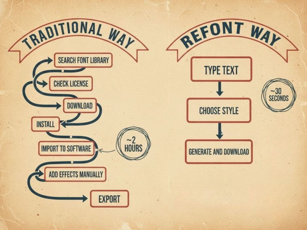
The Pain Points of Traditional Font Design
If you've ever tried to build a vintage-styled visual the traditional way, you know the drill. First, you spend an hour hunting through font libraries, only to find that half the good ones have ambiguous commercial licensing. Then you download the font, install it locally, import it into Illustrator or Photoshop, spend forty-five minutes trying to recreate the texture and shadow effects you saw in the reference image — and the result still looks a bit off. For a professional designer, this is Tuesday. For a small business owner, an Etsy seller, or a social media creator with three other jobs? It's a full afternoon gone, with uncertain results.
What Sets Refont's Retro Font Generator Apart
vs. Font Libraries — Search vs. Generate
Traditional font libraries are warehouses. You walk in, search the shelves, and hope something close enough is in stock. Refont is a factory — you describe what you need, and it builds it for you. More importantly, Refont skips the entire download-install-layout pipeline. The output isn't a raw .ttf file you still have to style yourself — it's a finished, aesthetically complete visual image, ready to drop into your design, post, or product listing immediately.
vs. Canva & All-in-One Design Platforms
Canva is genuinely great. No argument there. But "great at everything" and "exceptional at one specific thing" are different categories of excellence. When it comes to typographic artistry — the grain in a letterpress texture, the multi-layer shadow depth of a genuine 80s neon effect, the organic imperfection of vintage brush lettering — Refont operates at a depth that general-purpose design tools don't prioritize. If typography is the hero of your visual, a specialized aesthetic retro text generator will consistently outperform a Swiss Army knife.
High-Fidelity Output Ready for Any Material
What Refont generates isn't just a pretty preview. The output images carry the resolution and visual fidelity needed for real-world applications: T-shirt print files, poster designs, product packaging, social media covers, sticker sheets. You generate it, you use it. No post-processing required.
Zero Prompt Engineering Required
You don't need to write a carefully engineered AI prompt to get great results. You type your text, you choose a style direction, and the generator does the rest. There's no learning curve, no terminology to master, no trial-and-error prompt debugging. For a coffee shop owner who needs a new promo banner by tomorrow morning, or a GoodNotes enthusiast who wants a custom vintage header for their weekly spread, this zero-friction entry point is exactly what makes Refont actually usable — not just theoretically appealing.
How to Create Retro Style Font with Refont's Retro Font Generator
Here's the complete workflow — from finding your style inspiration to downloading a production-ready image. No design software, no font installation, no prompt engineering. Just the steps.
Step 1 — Browse Retro Font Styles for Inspiration
Open Refont's retro style font generator page and you'll land in a curated gallery of vintage typography examples — everything from bouncy 70s bubble lettering to stately Art Deco serifs to hand-inked brush scripts. The key here isn't to just look for fonts that match your project visually. It's to look for fonts that feel like your project emotionally. Ask: does this style evoke the mood I want my audience to be in? Does it carry the right era energy? The best starting reference is the one that makes you think, yes, that's exactly the vibe — even before you've customized a single letter.
Step 2 — Click "Generate Similar Font" to Create Your Match
Once you've found a reference style that resonates, hit "Generate Similar Font." The AI takes that style as its creative anchor and produces a set of matching vintage typography images within seconds. Don't settle for the first result if it's not quite right. Generate a few variations, compare them side by side, and look for the one that best balances authenticity, readability, and the specific emotional tone you identified in Step 1. The generator is fast enough that iteration costs you nothing but a few extra seconds.
Step 3 — Customize Your Retro Style Font
Now make it yours. Enter your actual brand name, tagline, product title, or event name — whatever text this visual is meant to carry. Adjust the style settings to dial in the exact vintage look you're after, whether that means pushing the texture heavier, shifting the color palette, or refining the overall composition. This step is where the retro style font generator shifts from a tool into a design partner. Some specific scenarios where Step 3 unlocks real value:
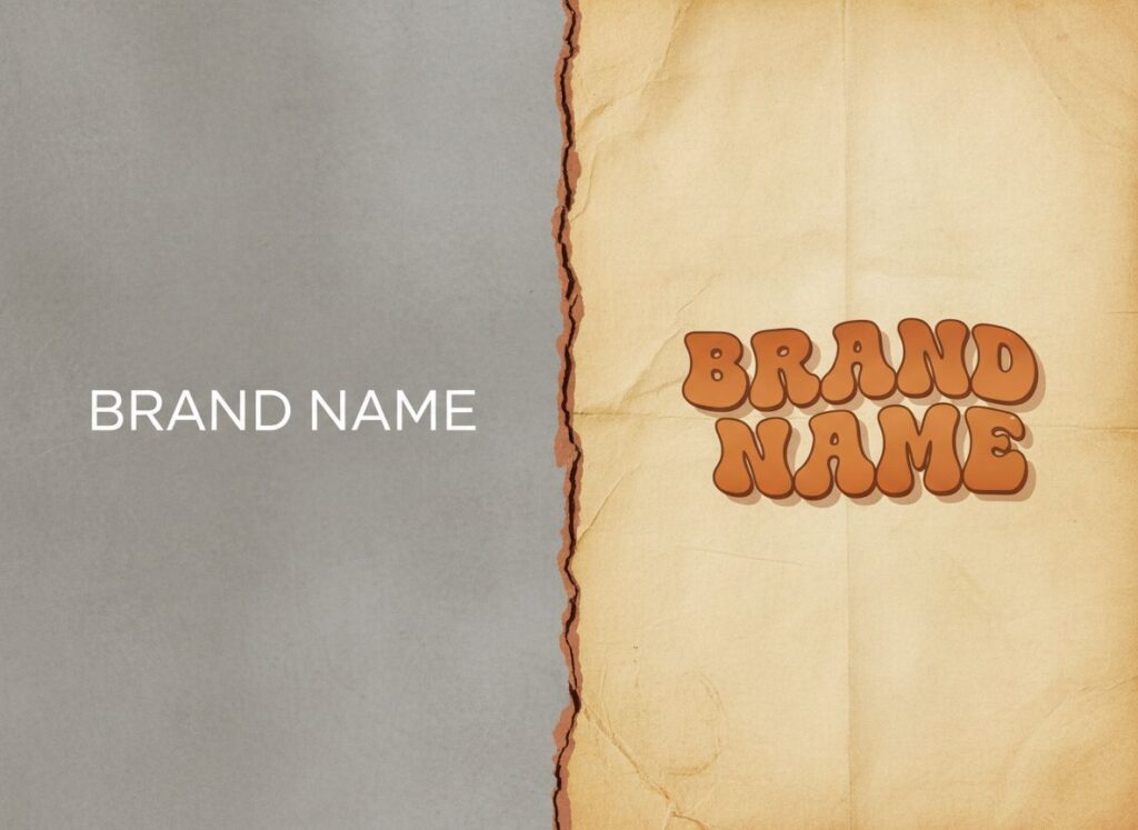
- Brand naming preview: Generate your vintage brand name in five different retro styles before committing to a visual direction.
- Social media headline: Create a retro-styled title card that stops the scroll on Instagram or TikTok.
- Seasonal promotion: A 70s-disco-styled "Summer Sale" header transforms a routine promotion into a visual event.
Design Tips — Blending Retro Fonts with Modern Backgrounds
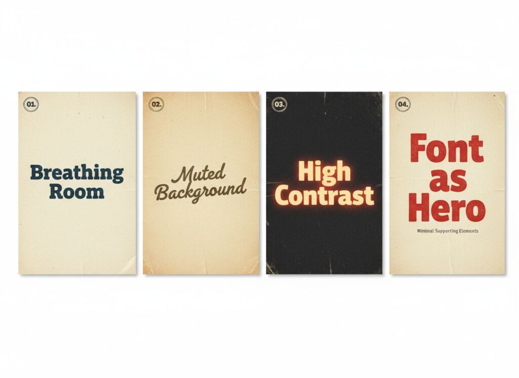
Generating a great retro style font is step one. Making it work in your final composition is step two. Here are four principles that make the difference:
Give it breathing room. Retro fonts are dense with visual information. Surround them with generous white space (or negative space) to let the detail land. Cramped layouts suffocate ornate typography.
Choose muted or tonal backgrounds. Cream, warm sand, deep charcoal, aged parchment — these tones support a retro font without competing. Avoid busy photographic backgrounds; they pull attention away from the typography, which is your actual hero.
Use contrast as a design tool. The most visually impactful retro compositions often live at the extremes: almost-black backgrounds with warm neon lettering, pure white with deep rust typography. High contrast doesn't diminish the vintage feel — it amplifies it.
Let the font lead. Resist the urge to add decorative elements "to make it more retro." If the font is doing its job, it doesn't need an entourage. Every additional element you add is visual attention your typography loses.
Retro Style Font Inspirations & Real-World Use Cases
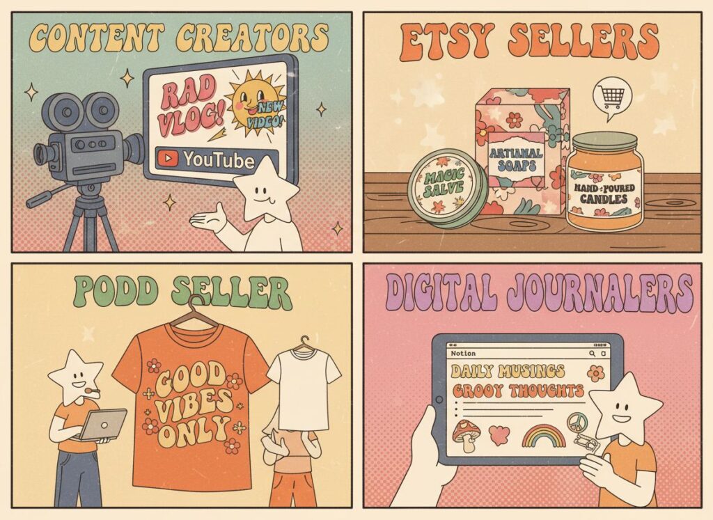
The best retro style font is the one that fits the right person, in the right project, at the right moment. Here's a targeted inspiration guide matched to the users who actually need vintage typography the most — and the specific scenarios where it consistently delivers results.
Who Should Use Retro Style Font?
Social Media Creators & Influencers
If you're building an audience on TikTok, Instagram, or YouTube, you already know that the thumbnail is half the battle. Retro style font has a unique scroll-stopping quality in social media environments precisely because they contrast so sharply against the algorithmically homogenized content surrounding them. For entertainment and lifestyle creators, 70s Groovy fonts bring warmth and energy. For fashion and beauty creators leaning into current trends, Y2K Chrome scripts tap directly into the aesthetic their audience is already searching for.
Indie Brands, Etsy Sellers & Small Business Owners
Running a vintage clothing shop, an artisan candle brand, or an independent café means you're constantly competing against businesses with real design budgets. Vintage typography for branding is one of the few areas where a well-chosen aesthetic can completely level that playing field. With Refont, you can generate a brand name in a dozen retro styles in the time it would take a design agency to reply to your inquiry email. Logo previews, packaging label text, seasonal promotion headers — all of it, in minutes.
Print-on-Demand (POD) Sellers
The POD market on Redbubble and Amazon Merch has a specific, well-documented truth: certain retro aesthetics consistently drive higher conversion rates than generic modern designs. 70s Groovy lettering on T-shirts, 80s neon text on phone cases, distressed vintage scripts on tote bags — these aren't niche tastes, they're proven bestselling categories. The practical advantage of Refont for POD sellers is speed of iteration. Generating ten design variations to A/B test in a single afternoon isn't just possible — it's the entire competitive strategy.
Digital Journaling & Notion Enthusiasts
The digital journaling community has a quiet but intense hunger for aesthetic typography elements — custom headers, decorative dividers, mood-matching stickers, weekly spread titles. The challenge is that most available resources are either too generic or too expensive for personal use. Retro style font generated by an aesthetic retro text generator like Refont fill this gap perfectly: they're visually distinct, they carry personality, and they can be customized to match the exact mood of your weekly theme — whether that's a warm autumn harvest spread or a neon 80s productivity layout.
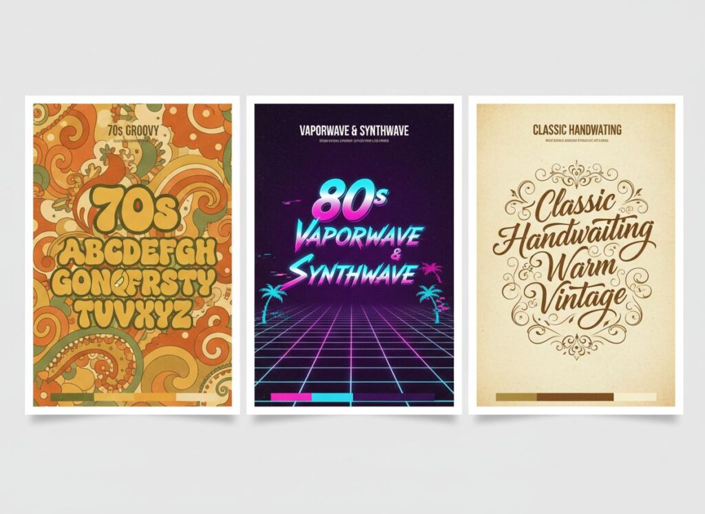
Retro Style Trend Categories
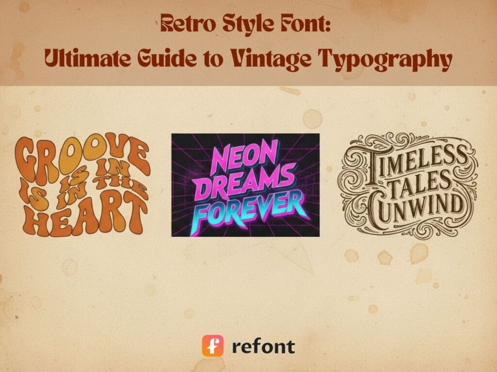
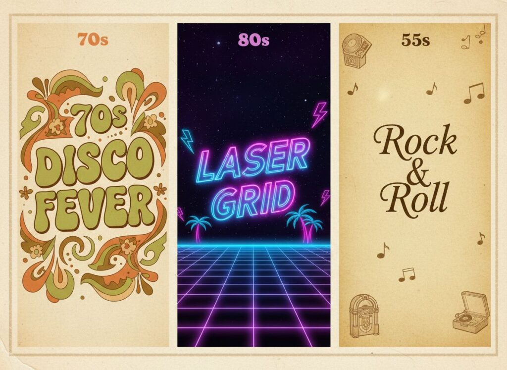
70s Groovy & Psychedelic Retro Style Font
Defined by flowing organic curves, warm earth-tone gradients — think avocado green, burnt sienna, harvest gold — and the swirling psychedelic patterns that defined 1970s rock poster art. This style emerged from the collision of hippie counterculture, the Summer of Love's visual language, and the hand-lettering tradition of independent print studios. Best applications: music festival merchandise, independent art fair posters, farmers' market and organic brand identity, bohemian lifestyle content, wellness and yoga brand visuals.
80s Vaporwave & Synthwave Retro Style Font
Neon magenta, electric blue, chrome gradients, geometric grids, and that particular quality of early digital ambition — the 80s Synthwave aesthetic treats the future as a place you can visit, as long as you bring the right synthesizer. Revived and transformed by Vaporwave and Retrowave music subcultures, this style has become the dominant visual language of nostalgic futurism. Best applications: tech and gaming brand content, cyberpunk-themed events and merchandise, overseas social media content targeting Western Gen Z and Millennial audiences, Y2K-adjacent fashion brand visuals.
Classic Handwriting & Warm Vintage
Think of the handwriting on your grandmother's recipe cards, or the carefully inked address on a 1950s postcard. Classic vintage script fonts carry a warmth and intimacy that no other typographic category can replicate — they communicate care, craft, and the sense that something was made by a specific human being for a specific reason. Best applications: artisan bakery and café branding, handmade product packaging, personal business card design, digital journal headers and stickers, holiday greeting card text, wedding and celebration event visuals.
Frequently Asked Questions About Retro Style Font
Q1: Is Refont's retro font generator free to use? Refont offers a free entry-level experience — you can browse the retro style library and generate previews without creating an account. For high-resolution exports and advanced customization options, check the current plan details on the official Refont website, as offerings are updated regularly.
Q2: Can I use the generated retro style font images commercially? Refont-generated images are designed to support commercial use cases — this is core to why the tool exists for POD sellers, Etsy brands, and small business owners. That said, always verify the current terms of service on Refont's official site before incorporating generated visuals into large-scale commercial campaigns, to ensure you're working within the most up-to-date usage guidelines.
Q3: Are the exported images high enough resolution for print materials? Refont outputs high-fidelity images suitable for standard digital applications and most print-on-demand material requirements — including T-shirts, posters, stickers, and packaging. For specialized large-format print applications (exhibition banners, outdoor signage), we recommend confirming the export specification details on Refont's site to match your specific print vendor's requirements.
Q4: Can I really use Refont's retro font generator with zero design experience? Yes — and this is arguably the most important thing about it. The entire tool is designed around the assumption that most people who need great retro typography are not professional designers. Browse, select, enter your text, generate. That's the complete workflow. The aesthetic retro text generator handles the craft; you focus on the creative direction.
Start Designing with Refont's Retro Font Generator Today
Retro style font isn't a nostalgia trip. They're a precision tool for standing out in a visual world that's increasingly indistinguishable from itself. The era that suits your brand is already there — in the flowing curves of a 70s groovy font, in the electric geometry of an 80s synthwave script, in the handwritten warmth of a classic vintage letter. Vintage typography for branding has never been more accessible, and an aesthetic retro text generator has never been more capable. Three steps. Your text. Your era. Your visual. Visit Refont's Retro Style Font Generator and create your first vintage typography visual — no design skills required.