Graffiti Alphabet Font Guide: Styles, Tips & Inspiration
Contents
- What Is a Graffiti Alphabet Font — And Why It's Having a Cultural Moment
- Why Refont's Graffiti Alphabet Font Generator Stands Out
- A Complete Guide to Graffiti Alphabet Font Styles
- Pro Tips for Designing with a Graffiti Alphabet Font Generator
- Frequently Asked Questions About Graffiti Alphabet Fonts
- Conclusion — Let Your Letters Do the Talking
You're staring at your new YouTube thumbnail. The footage is fire, the edit is clean — but the title text sitting on top looks like it was typed in 2009 Microsoft Word. Something's off. What that thumbnail is missing isn't color or contrast. It's personality. It's the visual equivalent of someone showing up to a sneaker release in business casual. The right graffiti alphabet font would have fixed this in about thirty seconds.
This guide covers everything you need to confidently work with graffiti alphabet font in 2026: what makes a graffiti alphabet font different from every other typeface, which styles exist and when each one earns its place, and the practical tricks that separate outputs that look generated from outputs that look crafted. Whether you're designing streetwear graphics, building a gaming brand, or just trying to make your Instagram story actually stop the scroll — let's get into it.
What Is a Graffiti Alphabet Font — And Why It's Having a Cultural Moment
More Than Just Letters
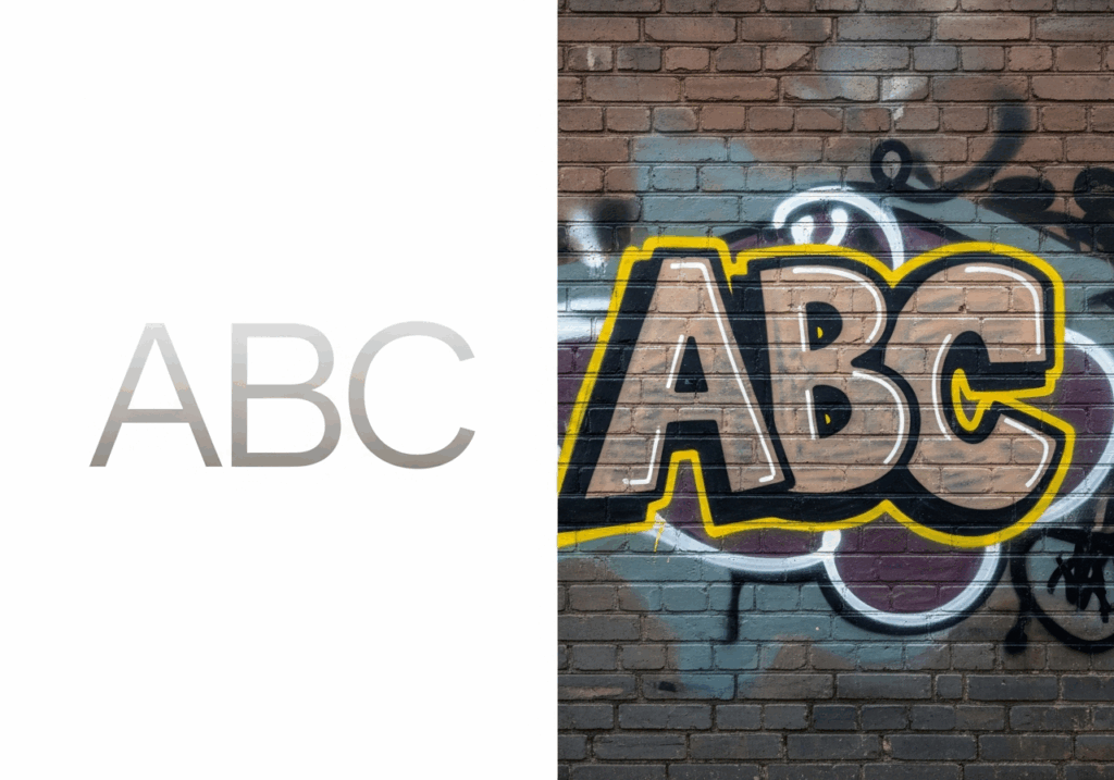
Here's the thing about a graffiti alphabet font that most people get wrong: they treat it as decoration. A visual seasoning you sprinkle on top of existing design. But graffiti alphabet font has never been about decoration — it's always been about declaration.
Graffiti as a lettering tradition dates to the New York City subway system of the early 1970s, where artists developed entire visual languages to communicate identity, territory, and skill to an audience that could read the codes. Every style — from the quickest tag scratched onto a metal door to a sprawling Wildstyle mural covering an entire train car — carried meaning beyond the literal words it spelled out. The letters themselves were the message.
What separates a graffiti alphabet font from, say, a bold condensed sans-serif or a rough-textured display font is its intentionality of imperfection. Traditional typography is about control: consistent optical sizing, harmonized stroke weights, mathematically precise spacing. Graffiti alphabet font breaks all three rules on purpose. Letters breathe and lean. Strokes vary in weight because a real hand varied in pressure. Forms overflow their boundaries because the artist wanted them to. The result feels alive — and that feeling is the entire point.
The Y2K Revival and Subculture Aesthetics in Design
Something interesting is happening in visual design right now, and graffiti alphabet fonts are right at the center of it. The Y2K aesthetic revival — chrome gradients, pixelated glyphs, aggressive maximalism, unabashedly loud visuals — has given designers and creators a cultural permission slip to be deliberately rough, deliberately expressive, deliberately un-polished.
For Gen Z and younger Millennials who grew up watching graffiti alphabet font on skate videos, hip-hop album covers, and early internet forums, this visual language carries genuine nostalgia and authenticity. Brands that once hired consultants to "clean up" their aesthetic are now paying premium rates for designers who can expertly work with a graffiti alphabet font to make things look credibly imperfect. The underground has gone overground — and the demand for graffiti-inspired typography across streetwear brand design, social media content, gaming visuals, and independent creator branding has never been higher.
Why Refont's Graffiti Alphabet Font Generator Stands Out
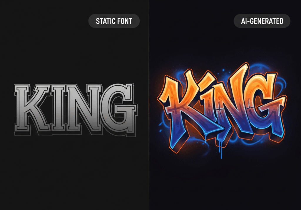
There are a lot of "graffiti alphabet font generators" on the internet. Most of them are basically digital vending machines: you drop in a word, they hand back a letter-by-letter swap from a static font file. The result looks like exactly what it is — a mechanical substitution with zero artistic intent. If you've ever tried one and thought "this looks cheap," you weren't wrong. It was.
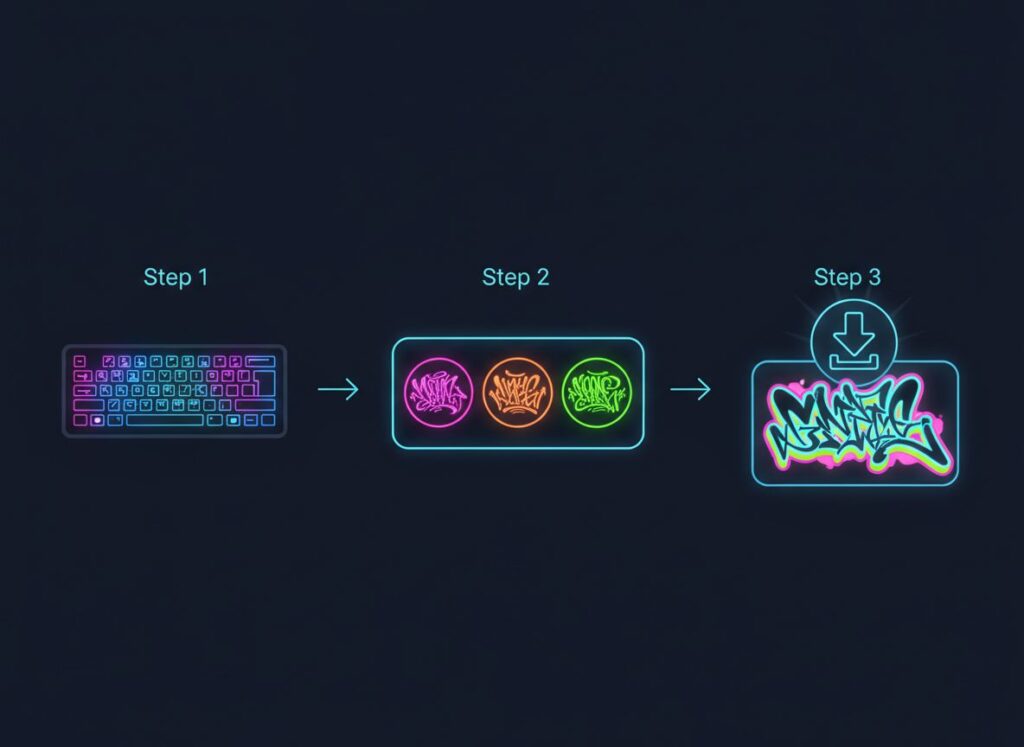
Three Steps, Zero Design Skills
Refont's approach is different in its philosophy before it's different in its execution. The core premise is that a great graffiti alphabet font tool should feel like having a skilled letterer on call — not like operating a photocopier.
The interaction is genuinely three steps: pick your style, type your text, export your result. No account creation required to start. No software to install. No tutorial to watch before you can produce something. This "tool as utility" philosophy matters especially for the users who need it most — a TikTok creator who has ten minutes before posting, a streetwear brand owner building their first product line, a junior designer who needs to deliver ten options by end of day. Speed without compromise isn't a feature; it's the point.
Traditional design tools — Photoshop, Illustrator — have enormous power and an equally enormous learning curve. Getting a professional graffiti alphabet font result from either tool without foundational skills in pen pressure simulation, vector path manipulation, and typography fundamentals is genuinely difficult. Refont sidesteps that entire problem.
AI-Driven Character — Not Just Font Mapping
The visual quality difference between Refont and a static graffiti alphabet font substitution tool comes down to one thing: the AI doesn't treat your text as a string of isolated characters. It treats it as a composition.
When you type "KING" into a standard graffiti alphabet font tool, you get four independently-generated letters placed next to each other. When you type the same word into an AI-driven generator, the system considers how those four specific characters should relate to each other — where the I leans toward the N, how the G's curve echoes the K's counter, whether the overall visual weight distributes evenly across the word. The output has compositional intelligence that a letter-swap approach simply cannot produce.
The line quality also matters here. Refont simulates the physical behavior of real graffiti alphabet font tools — the slight bleed at the edge of a spray can pass, the dry resistance of a marker on a textured surface, the natural variation in stroke thickness that comes from hand movement. These subtle properties are what make the result read as crafted rather than computed.
Real-Time Preview and Instant Style Switching
One of the more underrated aspects of Refont's experience is what happens between decisions. The preview updates as you type, and switching between sub-styles — Bubble, Wildstyle, Tagging — is instant. For a bubble graffiti alphabet font versus a Tagging variant, you don't export one, open it in Photoshop, evaluate it, close the file, go back, generate the other, and compare. You just switch. The comparative evaluation that used to take an hour takes about three minutes.
For brand teams, this is genuinely transformative. A streetwear label that needs to evaluate twenty graffiti font options for a new collection can run through the whole comparison in a single sitting, on a laptop, in a café, without a design team in the room.
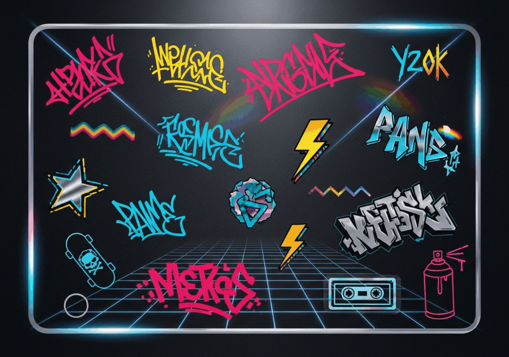
A Complete Guide to Graffiti Alphabet Font Styles
Not all graffiti alphabet fonts are the same — and using them interchangeably is like ordering "a coffee" at a specialty café and being surprised when the barista asks seventeen follow-up questions. The style you choose communicates as much as the words you type. Here's what you actually need to know.
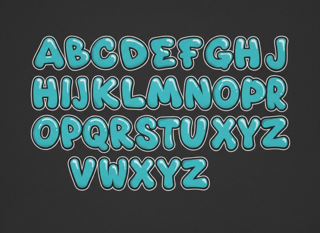
Bubble Style — Bold, Round, and Crowd-Pleasing
Bubble graffiti is what most people picture when they hear "graffiti alphabet font" — and there's a reason it became the popular face of the style. Each letter is inflated to its logical extreme: strokes are thick, corners are rounded into curves, and the overall silhouette of each letter reads as a single plump, pressurized shape. A heavy outline stroke and inner highlights push the three-dimensional illusion. The result is friendly, loud, and inherently readable.
That readability is the key advantage of bubble graffiti alphabet font — at any size, the letterforms stay legible. This isn't true of every graffiti alphabet font style, and it makes Bubble the pragmatic choice for any application where the text actually needs to be read quickly.
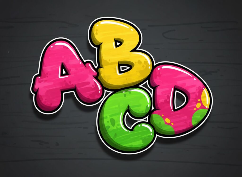
Best Use Cases for Bubble Graffiti Alphabet Font
Bubble works wherever you need visual impact without sacrificing comprehension: YouTube channel logos where the name must read at 40×40px in a thumbnail; merchandise tags and garment labels for youth-oriented product lines; gaming clan tags and Discord server icons; social media story overlays for music events, giveaways, and announcement posts. If you're a TikTok or YouTube creator building a personal visual identity from scratch, Bubble is almost always the smart first choice — it plays well with everything and offends no one.
Wildstyle — Complex, Interlocking, and Impressive
Wildstyle is where graffiti alphabet font becomes an art form that demands investment. Originating in New York's subway scene in the late 1970s, Wildstyle is characterized by extreme complexity: letters are extended well beyond their normal proportions, arrows protrude from strokes, individual letterforms merge and interlock with each other, and the overall composition often requires deliberate study before the underlying text becomes readable.
That complexity isn't a design flaw — it's the point. In street culture, the difficulty of reading a piece signals the depth of the artist's skill. For modern design applications, this translates to visual prestige: Wildstyle communicates that whoever produced this knows what they're doing and is speaking directly to an audience that does too. It's exclusive in the best way.
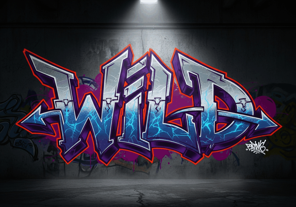
Best Use Cases for Wildstyle Graffiti Alphabet Font
Wildstyle is the right choice when the lettering itself is the hero of the design — not a supporting element. It's ideal for graffiti font for streetwear brand design, particularly for established labels with an existing street-credible audience; large-format print applications where scale lets the complexity breathe; album artwork and music visual identities; gaming stream overlay backgrounds and decorative screen real estate where text is ambient rather than informational. One critical caveat: Wildstyle at small sizes becomes illegible noise. If your text needs to function as a label, a button, or any navigational element — this is not your style.
Tagging & Dripping — Raw, Authentic Street Energy
Tagging is the most elemental form in the graffiti alphabet font family — a single-line signature written fast, typically with a marker or paint pen, where the goal is personal mark-making rather than visual spectacle. It prioritizes flow, speed, and the unique character that emerges when a hand moves without overthinking. The best tags look effortless because genuine effortlessness is what the style rewards.
The dripping variant adds something specific: controlled paint-trail effects below the letterforms, simulating gravity acting on freshly-applied spray. Those thin downward trails are a small addition that dramatically increases perceived authenticity, because real dripping is what happens when real paint meets a real surface. Digitally generated drip that looks like it was designed too carefully reads as fake immediately — the convincing version has irregularity.
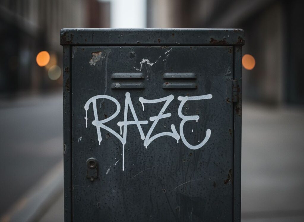
Best Use Cases for Tagging Style Graffiti Alphabet Font
Tagging and drip styles are best deployed when authenticity and personality matter more than legibility: personal brand signature marks for social media content and creator profiles; product label accents for independent or underground brands; photography and video watermarks that carry identity without demanding attention; event flyers with raw, handmade aesthetic goals; individual gaming handles and personal e-tags. A podcast host who wants their show name to feel like it was written on a city wall — not laser-printed in a corporate office — will find this style hits exactly the right note.
How to Choose the Right Graffiti Alphabet Font for Your Project
Three questions cut through the decision quickly.
Does the text need to be read immediately? If yes, Bubble or clean Tagging. If the visual experience matters more than rapid comprehension — brand identity, apparel prints, posters — then Wildstyle becomes viable.
How familiar is your audience with graffiti culture? Wildstyle requires cultural literacy to land correctly. For a general-audience context — a product label, a mainstream social post — Bubble communicates across the widest range of viewers. For a streetwear brand design project aimed at a culture-literate audience, Wildstyle's exclusivity is an asset, not a liability.
What's the output size? Wildstyle at thumbnail scale is just visual noise. Bubble at billboard scale can look cartoonish without the right weight. Match the visual density of your style to the scale at which it will actually be seen.
Pro Tips for Designing with a Graffiti Alphabet Font Generator
Knowing a tool exists and knowing how to extract everything it's capable of are genuinely different skills. These tips target the gap between what most users discover in their first five minutes and what experienced users do differently.
Hidden Features Most Users Miss
Generate single characters to build a custom alphabet set. Most users enter full words. But generating each letter of the alphabet individually gives you a full custom character set — one you can use as reference drawings, layout pieces, or trace-over material. This is particularly valuable for the bubble graffiti alphabet font style, where the individual letterforms are complex enough to be worth studying and referencing in secondary design work. Print all 26 letters at scale, pin them to your wall, and use them as the foundation for hand-finished artwork. Pop-up market vendors and independent apparel designers have been using this approach for years. Now it takes minutes instead of days.
Use numbers and punctuation as styled accent elements. Graffiti alphabet font generators render numerals and punctuation marks — exclamation points, ampersands, stars — with the same stylistic treatment as letters. A price point, event year, or jersey number generated in matching graffiti alphabet font style creates visual coherence that a plain numeral would break immediately. Try generating just a year or a single number in your chosen style and see how much more unified the full composition looks.
Export white text for overlay applications. When your generated graffiti alphabet font is destined for placement over photography, video content, or textured backgrounds, generate with white or light fill rather than dark. White graffiti alphabet font on a dark photographic background reads as physical paint applied to a real surface — a visual sleight-of-hand that makes digital composition look dramatically more authentic.
Workflow Tips for Faster Output
Generate all variants before evaluating any of them. If you're presenting options to a client, a brand team, or even just to yourself, generate every style variant before assessing a single one. Evaluating sequentially creates anchoring bias — the first result becomes the unconscious reference point against which everything else is measured. Seeing all your options simultaneously produces genuinely comparative evaluation. This one habit alone will improve your selection outcomes.
Test in context before you commit. The most common point of disappointment in graffiti alphabet font projects — for both bubble graffiti alphabet font work and more complex styles — is selecting something that looks great in the generator's white-background preview and falls flat in actual context. Drop your output into a realistic mockup of its final application before you decide. A t-shirt mockup, a YouTube thumbnail template, a phone screen wallpaper preview. Color relationships and scale dynamics that are invisible against white become obvious in context. What you thought was your third choice often becomes your first.
5 Common Mistakes to Avoid
Mistake 1 — Using Too Many Styles at Once
A graffiti alphabet font is a visually assertive choice. It fills space, demands attention, and has its own strong personality. Trying to layer multiple graffiti alphabet font styles in a single composition — Wildstyle headline, Bubble subtitle, Tagging accent — doesn't create visual richness. It creates a fight. Pick one style and commit. If you want visual variation, introduce it through color, size, and orientation — not through switching letterform styles within the same piece.
Mistake 2 — Ignoring Contrast and Background
Graffiti alphabet font was literally invented for complex urban surfaces. It lives on concrete, brick, and painted metal — backgrounds with texture, depth, and competing visual information. On a plain white or light-grey digital background, most graffiti alphabet fonts look flat and underwhelming. Always give your lettering a background that earns it: dark textures, photographic environments, gradient treatments with real energy. The letters look better and more authentic when they have something to fight against.
Mistake 3 — Skipping the Sub-Style Previews
First results are rarely best results. The sub-style variations within each graffiti alphabet font category represent meaningfully different aesthetic directions — not minor tweaks. A user who settles for the first Bubble variant they see without checking the other options is leaving significant quality on the table. Budget two minutes to cycle through every available sub-style before making a selection. The difference between a mediocre output and an excellent one is usually one or two more clicks away.
Mistake 4 — Stretching or Distorting the Output
This one is responsible for more ruined graffiti alphabet font design projects than anything else on this list. After exporting, the temptation to resize your asset in Canva, PowerPoint, or a social media platform's built-in editor without maintaining the original aspect ratio is constant — and consistently destructive. Graffiti letterforms, especially in the bubble graffiti alphabet font style, are carefully proportioned. Horizontal stretching makes letters look bloated and cheap. Vertical compression makes them look crushed. If you need different dimensions, regenerate at the right size. Never distort after the fact.
Mistake 5 — Treating Generated Art as Final Without Iteration
The biggest missed opportunity in working with any AI generator is using it exactly once per project. Professional-quality results almost always require iteration — multiple generation cycles where you adjust inputs, try different text lengths, experiment with style combinations, and compare outputs against each other. The time cost is genuinely minimal: each generation takes seconds. But users who generate once, decide it's "good enough," and export are consistently producing mediocre work when excellent work was three more generations away. Treat the generator as a creative dialogue, not a vending machine.
Frequently Asked Questions About Graffiti Alphabet Fonts
Can I customize individual letters in Refont?
Yes — and this is one of the most productive workflows available. Generating characters individually gives you maximum control over specific letterforms and lets you build a customized alphabet set for projects that need consistent visual language across multiple pieces. It's also useful for projects that combine generated graffiti alphabet font elements with hand-finished artwork, where having precise individual letterform references matters.
Do I need to install any software?
No, and this is a genuinely meaningful advantage. Refont runs entirely in the browser — no desktop app, no plugin, no version management, no hardware requirements beyond a device that can run a modern web browser. You can generate a graffiti alphabet font on a Chromebook, a tablet, or your phone. This accessibility ensures you can create a professional graffiti alphabet font whenever inspiration strikes.
How is this different from downloading a graffiti alphabet font from a font site?
Downloaded fonts are static: every instance of "A" across your entire document is the same glyph. However, a high-quality graffiti alphabet font from an AI generator considers your specific input text as a compositional unit, producing letterform relationships that are optimized for that exact word or phrase. This means your chosen graffiti alphabet font reads as a bespoke design rather than a collection of assembled blocks. For short text treatments — names, slogans, brand marks — the difference is visible immediately.
Conclusion — Let Your Letters Do the Talking
Graffiti alphabet fonts aren't a trend that arrived in 2026. They're a visual language that's been evolving for fifty years, finally made accessible to everyone — not just the people who spent decades learning to write it on walls.
What you've got now is the full picture: what a professional graffiti alphabet font actually is and why it's the right visual language for the current cultural moment; which style fits which context; how to use the tools available to you with intention rather than just luck; and what separates outputs that look casually generated from outputs that look carefully made.
The only thing left is to go make something. Whether you're designing streetwear graphics that are meant to outlive the trend cycle, building a gaming brand identity from scratch, or just trying to give your next YouTube thumbnail a little more soul — your letters are waiting.